Product · September 9, 2026 · 12 min read
A Cleaner User Profile Means More 'You' When It Comes to Personalization
Whistlr's profile update cuts visual clutter so your Mood, Blip, Halo, and Profile Skin stand out. See what changed, what stayed, and how to make it count.
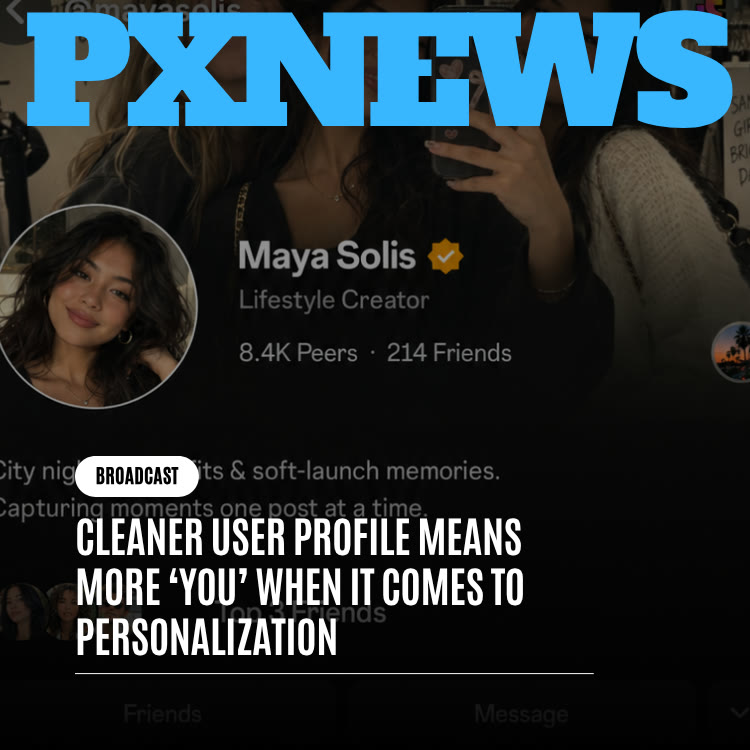
Whistlr's latest profile update does not add a new feature. It removes things. ETAPX went through the profile page and cleared away duplicate icons, crowded counters, uneven spacing, and labels that repeated the obvious, so the parts that are genuinely yours (your Mood, Blip, Halo, Skin, bio, and pins) have room to be seen. Nothing you set up has moved or been switched off. Your profile simply reads more clearly at first glance.
What the Profile Decluttering Update Actually Changed
Think of this release as editing rather than redesigning. The layout you know is still there, along with every setting and every personal touch you have added. What changed is the supporting material around those touches. The team looked at each element on the page and asked a blunt question: is this still earning its spot, or is it here because it was added once and never revisited?
Here is what that review produced:
- Grouped stats: Related numbers that used to sit in separate blocks, each styled a little differently, are now shown together once.
- One icon per job: Small icons that were repeating the same cue in several places were reduced to a single, clear instance.
- Even spacing: Sections that had been packed tightly now have consistent room between them, so the page reads as distinct areas instead of one long block.
- Clearer priority: Secondary details that you would look up deliberately were dialed back in visual weight, so first-glance elements get first-glance attention.
- Fewer captions: A handful of text labels that only described what was already obvious were removed.
Just as important is what is not on that list. No control was tucked behind an extra tap, no setting moved to a different menu, and no feature was removed. This was a visual and organizational pass only.
How Visual Clutter Creeps Into a Profile Page
Profiles rarely get messy because of one bad decision. They get messy through a long series of sensible ones. A new stat seems worth showing, so it gets a counter. A new feature needs a label, so one is added. An icon helps people recognize something faster, so it appears again in a second spot. Each choice holds up on its own review. Stack enough of them over many release cycles, though, and you get a page where everything is technically informative and nothing is easy to find.
Over the last year, the Whistlr profile gained a long list of expressive features: a layout built to work like a living snapshot of a person, Halo's ambient ring around your avatar, Profile Skins that restyle the whole frame, and Moods and Blips that change from day to day. Each of those launched as a deliberate addition. What had not happened until now was a step back to check whether everything surrounding them still made sense as a whole.
The cost of clutter is quiet but real. When every element carries roughly the same visual weight, a visitor cannot tell at a glance what matters. The most personal parts of a profile end up competing with counters and repeated symbols that have little to say.
The Design Principle: Let Personality Carry the Page
Every page needs some structure, such as borders, counts, and navigation, to hold the content together. Designers often call that structure "chrome." Trouble starts when the chrome gets loud enough to compete with the content it was supposed to frame. That is what had started to happen on Whistlr profiles.
A quieter frame does not make a quieter profile. It lets the personal parts speak loudest.
The goal of the update was not minimalism for its own sake. A bare page is not automatically a better page. The real objective was legibility of personality: making sure that someone landing on your profile immediately understands who you are and how you are doing right now, before their eyes drift to anything else. When the supporting interface steps back, your identity does not have to fight for attention. It becomes the obvious focal point.
How Halo, Profile Skins, Moods, and Blips Benefit
None of these features changed how they work. What changed is the space around them, and each one gains something different from that extra room.
Halo
Halo was designed to be subtle: a faint, translucent ring with a gentle pulse around your avatar instead of shouting like a notification badge. Subtle signals need calm surroundings to register. With fewer icons and counters crowding the avatar area, Halo's glow has a clear space to sit in and does its understated job better. If you want the background on the feature, read about Halo's growing popularity.
Profile Skins
A Profile Skin changes the look of your profile's frame, including backgrounds, accents, and the way sections are framed. A frame is easiest to appreciate when the foreground is not packed with dense stat blocks layered over it. Now that the foreground is lighter, whichever Skin you picked, whether it is warm and textured or sharp and high-contrast, comes through with less in the way. Our earlier piece on Profile Skins and their early-2000s inspiration explains where the idea came from.
Moods and Blips
Moods and Blips gain the most. The Mood badge next to your name and the Blip playing inside its round frame are supposed to catch a visitor's eye first, giving a live read on how you feel. Their whole value depends on being seen at a glance. Clearing the area around them leaves their appearance untouched, but it changes how quickly they register, which for these features is nearly everything.
How to Make the Most of Your Cleaner Profile
The update applies automatically, but a quieter page also makes weak spots easier to see. A few minutes of tidying on your end will make the most of it:
- Refresh your Mood: Your Mood now sits in a more prominent position, so keep it current. An outdated Mood is more noticeable than it used to be.
- Record a fresh Blip: If your Blip is months old, replace it with something that reflects you today.
- Revisit your Profile Skin: With less covering it, your Skin does more of the visual talking. Make sure it still matches the impression you want to give.
- Tighten your bio: Shorter, specific bios read better in a calm layout. Lead with what you do or what people should know first.
- Curate your Top 8 and links: Check that the people and links you feature still represent you well.
- Check your pinned content: Pinned posts now have clearer surroundings, so pin the work you most want a new visitor to see.
- Consider a video banner: If you have not tried it, a video profile banner can add motion to the top of a cleaner page.
When you are happy with it, share your profile so people can see the result. Whistlr's profile tools page covers the full set of options.
What a Cleaner Profile Means for Creators and Businesses
For anyone using Whistlr professionally, a profile is a first impression and often a deciding one. A new visitor who arrives from a Mini, a whistle on Chattr, or a shared link makes a quick call about whether to become a peer, tap a link, or keep scrolling. Every extra element on the page competes for that brief window.
- Your message lands faster: With less noise, your bio, your category, and your featured content are what a visitor reads first.
- Brand identity is clearer: A Profile Skin and a consistent visual style read more like a deliberate brand when they are not sharing space with redundant counters.
- Contact details stand out: Business profiles can display contact information such as a business email or phone number, and those details are easier to spot on a tidier layout.
- Pinned content works harder: A pinned product announcement, event, or best-performing post now has clearer framing and is more likely to be seen.
If you are setting up a professional presence for the first time, our guide to claiming your space on Whistlr walks through the essentials.
Borrowing the Same Thinking for Your Own Content
The principle behind this update is useful well beyond the profile page. Anything you publish on Whistlr can suffer from the same slow buildup of extras, and the same editing mindset can make it stronger.
Signs Your Posts Are Carrying Too Much
- Too many hashtags: A long string of tags can bury the caption itself. Pick the few that describe the post best.
- Stacked text overlays: On a Mini or a Story, several overlapping text boxes compete with the video. One clear line usually does more.
- Multiple calls to action: Asking people to follow, comment, share, and tap a link all at once dilutes each request. Choose the one that matters most for that post.
- Busy first frames: The opening second of a video sets expectations. A clean, readable first frame helps viewers understand what they are watching.
A Quick Editing Habit
Before you publish, look at your post the way the Whistlr team looked at the profile and ask whether each element is pulling its weight. If removing something would not cost the viewer any meaning, consider removing it. The same goes for your profile over time: as you add links, pins, and Top 8 picks, check back every so often and trim what no longer fits. When the page looks right, sharing your profile is the easiest way to show it off.
What Stays Exactly the Same
Because cleanup passes can be mistaken for bigger overhauls, it is worth spelling out the boundaries:
- Halo: The ring, its pulse behavior, and what it signals are unchanged.
- Profile Skins: The same themes and the same way of applying them, now inside a cleaner frame.
- Moods and Blips: How you set and update them is unchanged. They simply carry more visual weight.
- Bio and pinned content: Same editing controls and same content, with tidier structure around them.
- Settings: Nothing moved. Every option is where you left it.
You do not need to update the app in any special way or turn anything on. Your existing profile carries over as it was, just with more breathing space. If you never consciously notice the change, that is a sign the work did what it was supposed to do.
Why ETAPX Prioritized Cleanup Over New Features
Decluttering is a hard sell inside any product team. It draws on the same design and engineering hours that new features need, and those features come with a launch moment and something concrete to point at. A pass focused on spacing and duplicate icons has to be justified differently: not by what it adds, but by how much sharper the rest of the page looks afterward.
ETAPX made the case on longer-term grounds. With so much personal expression now living on the profile, the surrounding noise had started to work against the features the team had already built. Leaving it would have meant every future profile feature arriving into a more crowded page and landing with a little less impact than the one before. Clearing it out now protects both what is already there and what comes next.
There is also a simple fairness argument. People put real thought into choosing a Skin, recording a Blip, or picking the Mood that matches their week. Those choices deserve to be seen clearly by everyone who visits. A page that buries them under redundant numbers quietly undercuts the effort people invest in expressing themselves, and fixing that is as much a part of building good personalization tools as shipping the tools in the first place. Seen this way, the cleanup is not housekeeping on the side. It is part of the personalization work itself, finishing the job that each of those earlier launches started.
Where Whistlr Profile Design Goes From Here
The team is treating the cleaner layout as a new baseline rather than a one-off project. Instead of letting clutter build back up, the plan is to add a lighter review step for future profile additions, asking not only whether a new element is useful but whether it deserves the visual space it would take up next to everything else.
That does not mean the profile is frozen. Whistlr will keep expanding what a profile can show and express. The intent is that each future addition gets the same scrutiny this cleanup did, so your personality stays the center of the page no matter how many options you have for expressing it.
Frequently Asked Questions
What changed in the Whistlr profile update?
The update is a visual cleanup. Related stats were grouped, duplicate icons were reduced to one, spacing was made consistent, and labels that restated the obvious were removed. No features were added or taken away.
Did Halo, Profile Skins, Moods, or Blips change?
Not in how they work. Each feature behaves exactly as before. They now have more space around them, so they are easier to notice at a glance.
How do I get the new Whistlr profile layout?
No. The cleaner layout applies to every Whistlr profile automatically. Everything you set up before, from your Mood and Blip to your Skin and pins, carries over unchanged.
Was anything removed from my Whistlr profile?
No. Every feature is still there, and no setting moved behind an extra tap. Only redundant visual elements, such as repeated icons, duplicate counters, and unnecessary labels, were taken out.
How can I make my Whistlr profile stand out?
Keep your Mood current, record a fresh Blip, choose a Profile Skin that fits your style, and write a short, specific bio. Pin the posts you most want new visitors to see and review your Top 8 and links so they still represent you.
Why does a cleaner profile matter for business accounts?
Visitors decide quickly whether to follow, tap a link, or move on. A less crowded profile puts your bio, branding, contact details, and pinned content in front of them first, which makes that decision easier.
Your Whistlr profile was always meant to be about you, not the furniture around you. With the clutter cleared away, the Mood, Blip, Halo, and Skin you chose finally get the spotlight, so take a minute to make sure they say what you want them to say.